Design a Poster
Warp to...
What is postering
- In the area of academic conferences, postering is for Graduate Students (Masters and Phd) and, depending on the conference, sometimes undergraduates.
- When postering, students stand next to their posters for a given time slot (usually an hour) and people can approach and have a conversation with the student about their research.
- Science Fair in Elementary Schools are meant to mimic Conference postering to prepare young minds for later academic research work.
- There are a lot of websites that discuss how to create an academic poster.
- Don't listen to them.
- Instead, listen to those who are on the cutting edge of the moment to change posters.
Create a Poster: Design 101
- Layout and design can take years of course work and practice to master.
- Layout and Design is NEVER about what looks cool.
- The overarching principle for a poster should be that every element (text, image and graphic) must have a REASON for its placement, orientation, color, and alignment.
- You'll need an abstracted overarching concept to be the arbiter of all your creative decisions.
- Above all, learn to let go. Just because you initially found a font type or image or layout enticing does NOT mean the poster should stay that way.
- Intuition is never part of the process in layout and design.
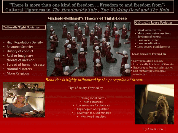
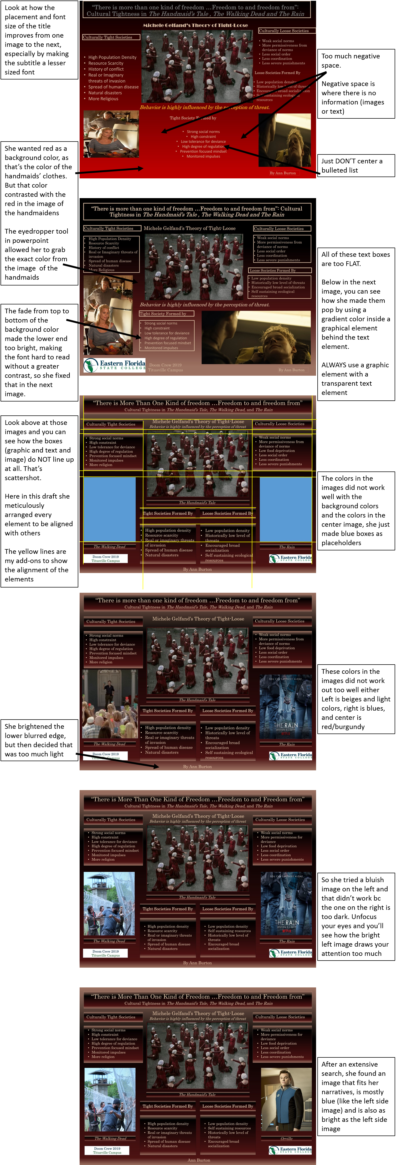
- In Ann's progression of "There Is More Than One Kind of Freedom," below, she desperately wanted the phrase "Behavior is highly influenced by the perception of threat"
- It doesn't seem to work but she really really wants it; by the fourth draft, and the phrase just being clunky, it finally vanishes from the poster.
- She let it go.
- In the fifth draft she had an insight as to where it could properly go.
Examples of Abstracted concepts
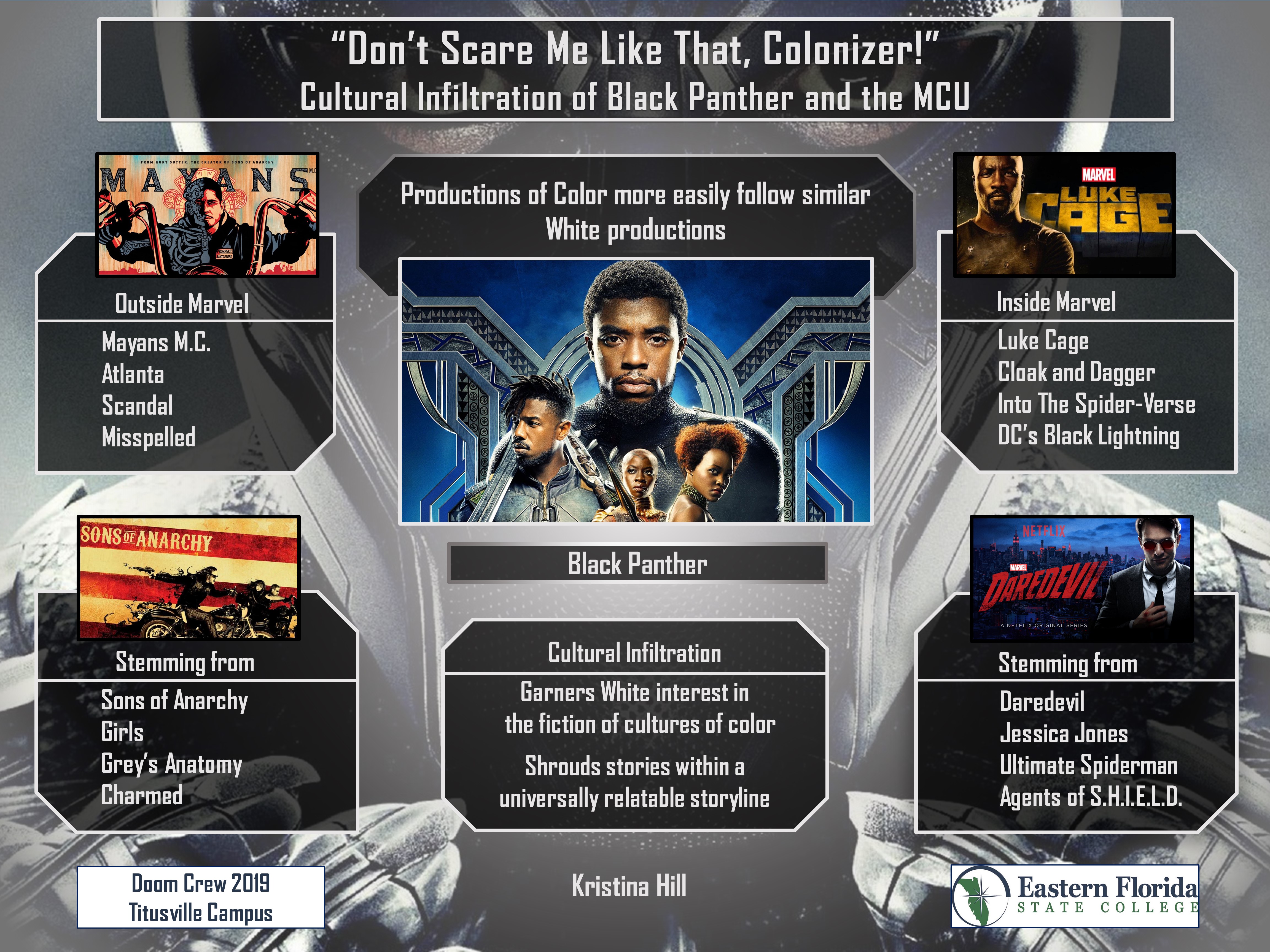
- Kristina's Angular Order.
- The angles are recursive across layers
Zoom in
Zoom in
Zoom in
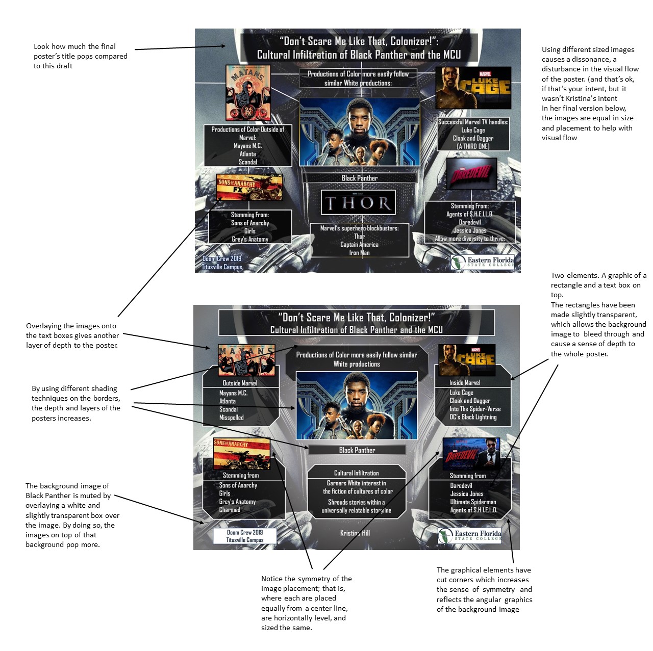
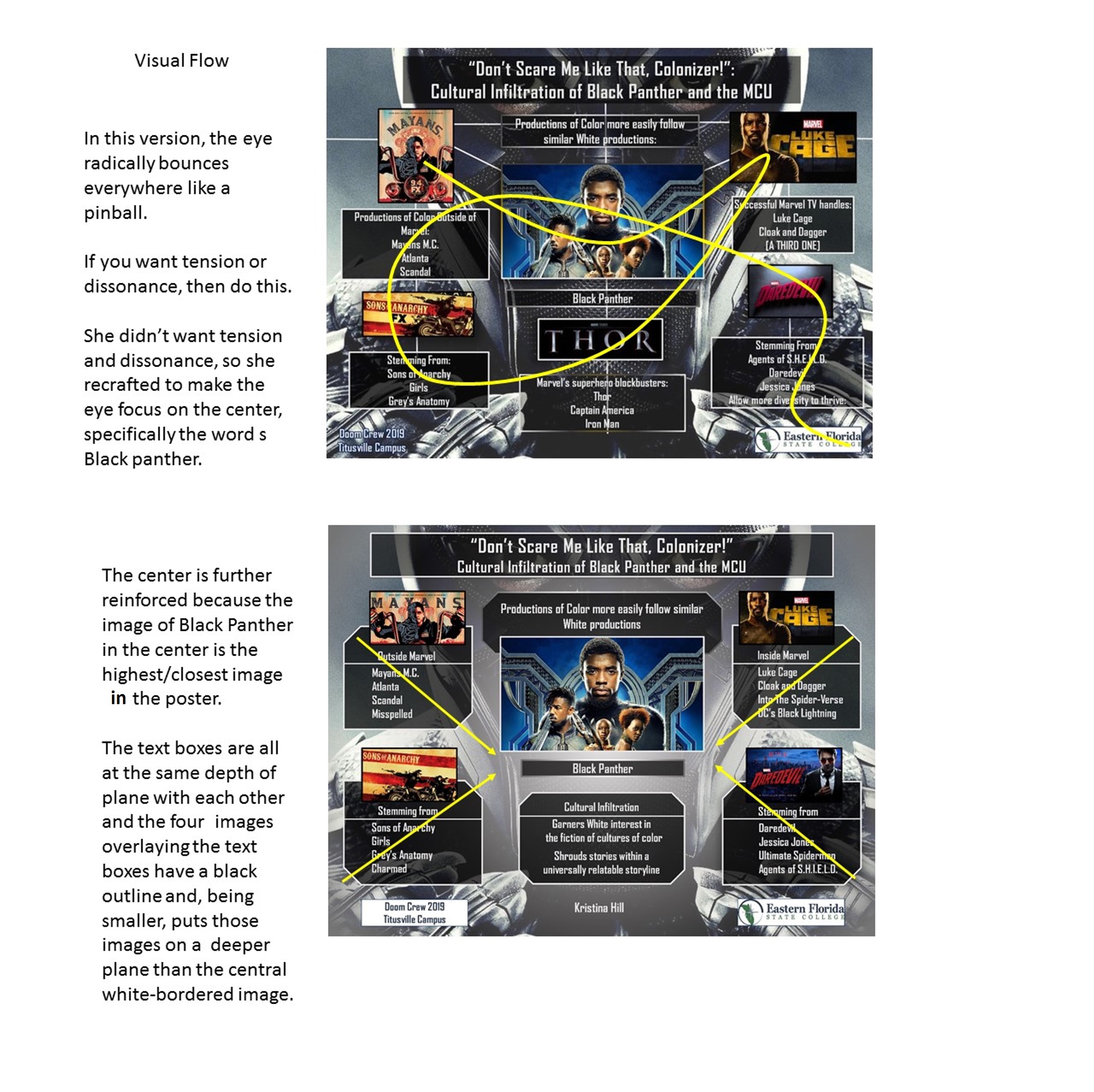
Constantly revising/tweaking
- Making a good poster depends on tweaking every single aspect of the poster, down to the pixel movement of elements.
- This is an animation of Ann's first draft transitioning to the final version.
Zoom in
- Below, closely look at the intricate changes that transformed the first draft to the final draft
Zoom in
Resources
- Choose images
- Choose a color scheme from the images
If you've ever taken an eye color/hue test, you'll know that we all don't see colors the same way. Evidently, "1 out of 255 women and 1 out of 12 men have some form of color vision deficiency."
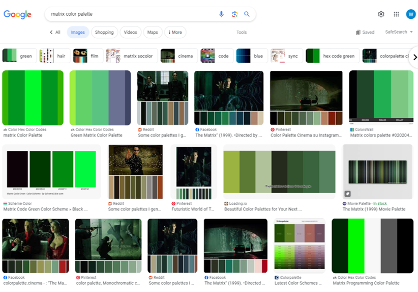
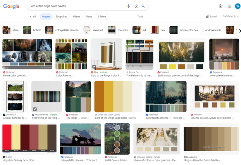
Due to these considerations of subjectivity in seeing color, you should opt to find a color pattern below. - Or, choose a filmic color palette
Easily available online, you can find many films' color palettes.
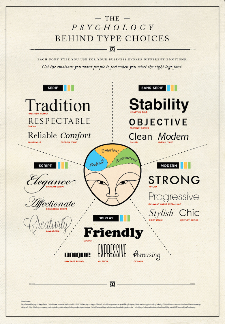
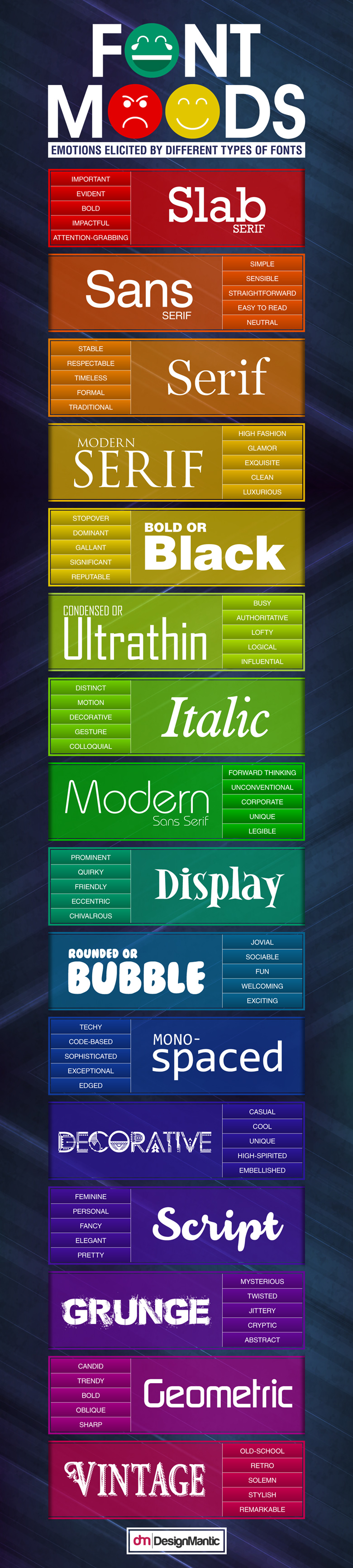
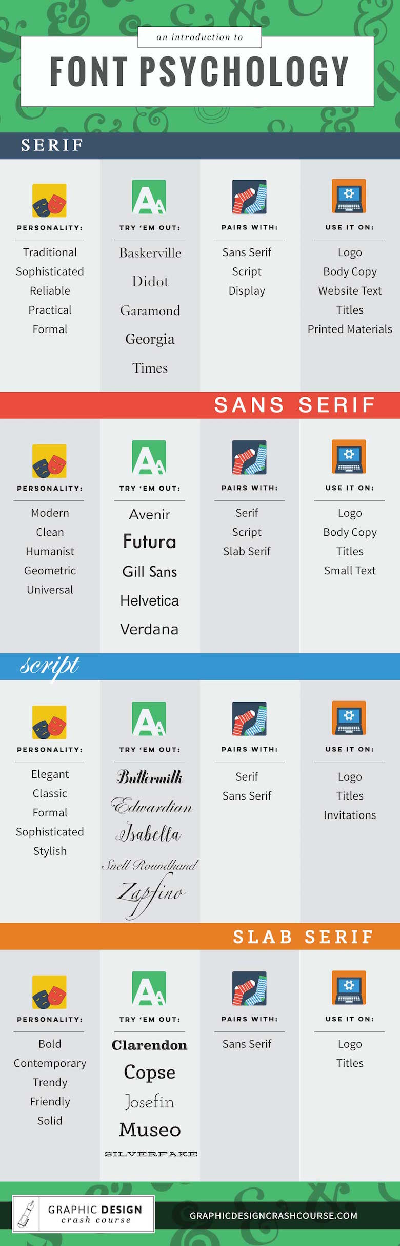
- Choose font types
The Poster Template
- Do not-- Do Not-- DO NOT ever use a template that power point provides.
- DON'T!
- EVER!
- (not kidding, seriously just never)
- Here's your template:
- In powerpoint, set your blank slide size to 48" wide and 36" high.
- (If you have an older Power point program that will not enlarge to that size, use 36" x 27")
Poster Examples
Example 1
Like the layering of text and image elements in the Black Panther poster above, this one extends images over text boxes, and those text boxes are set to a transparency to allow the larger background image to be partially seen.
Zoom in
Example 2
Instead of making the text boxes tranparent, this poster has gradient colors in each test box that are similiar to the central white flare on the background. Because this poster is text intensive, that centralized white flare aids in returning the viewer's eye to center (as there are no images to entice and lead the viewer)
Zoom in
Example 3
This poster uses box sizes that are intentionally different sizes (to cause a bit of unease) with different color borders to each box. Each color of those boxes connects to the character the box discusses.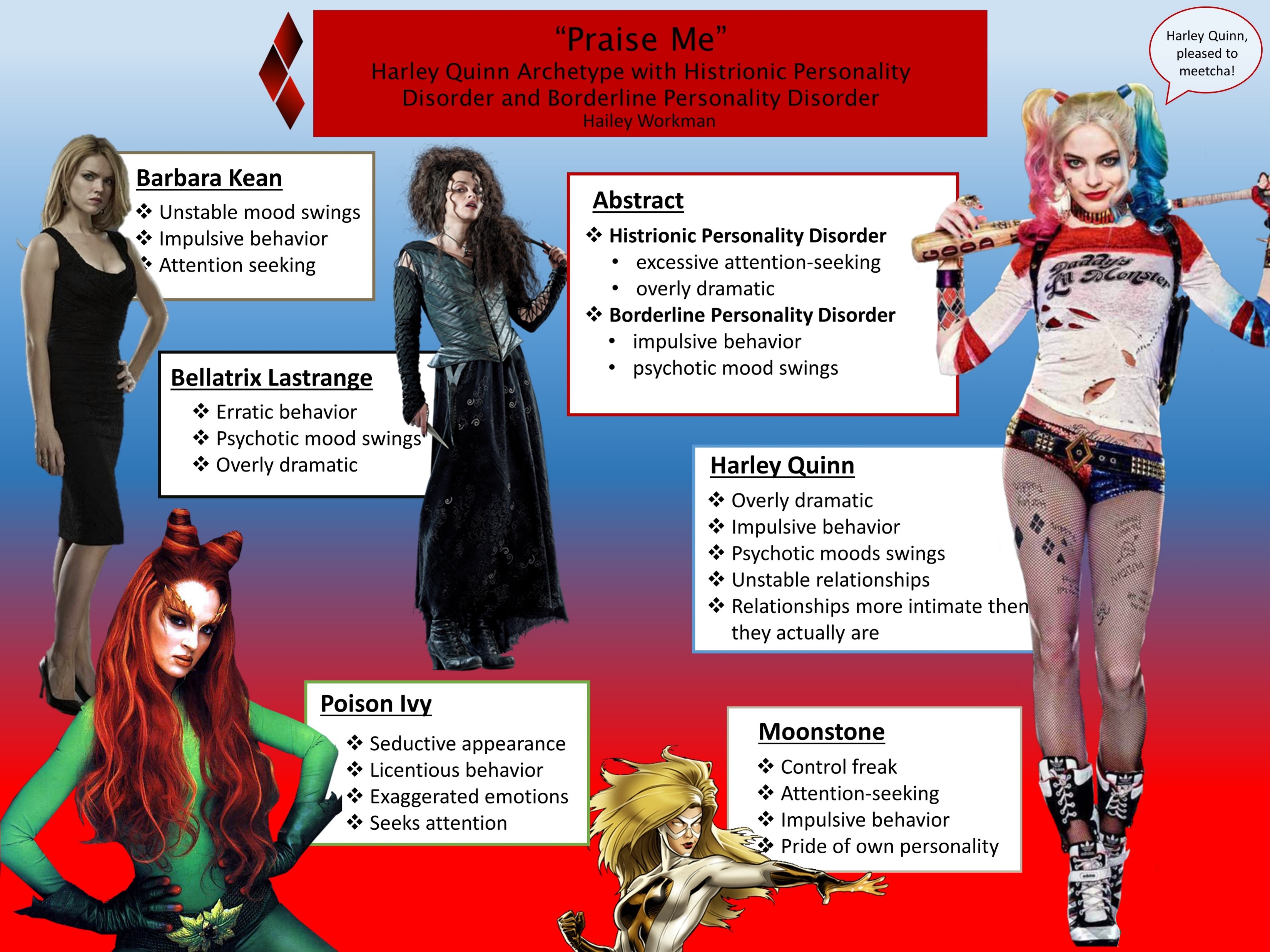
Zoom in
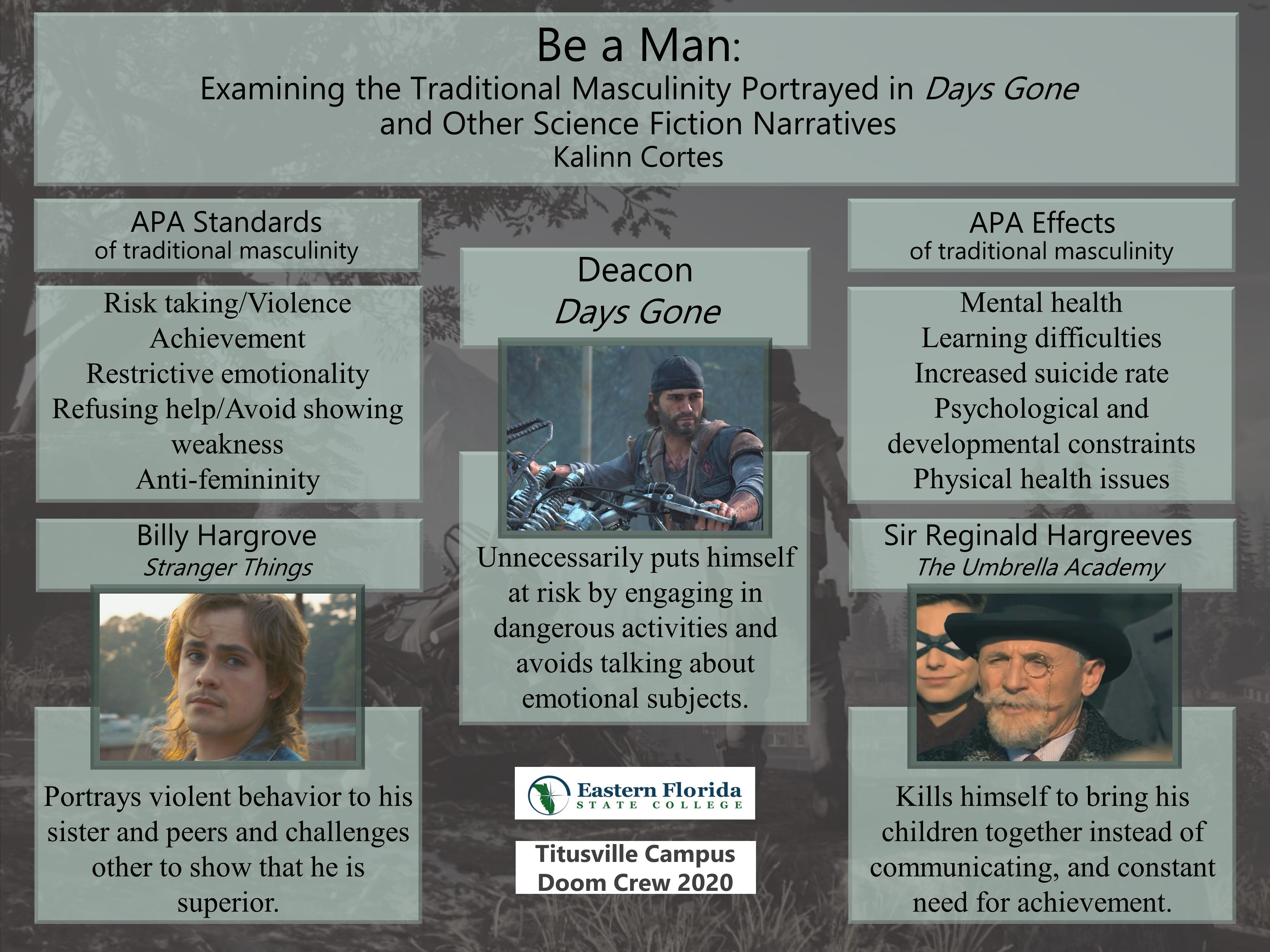
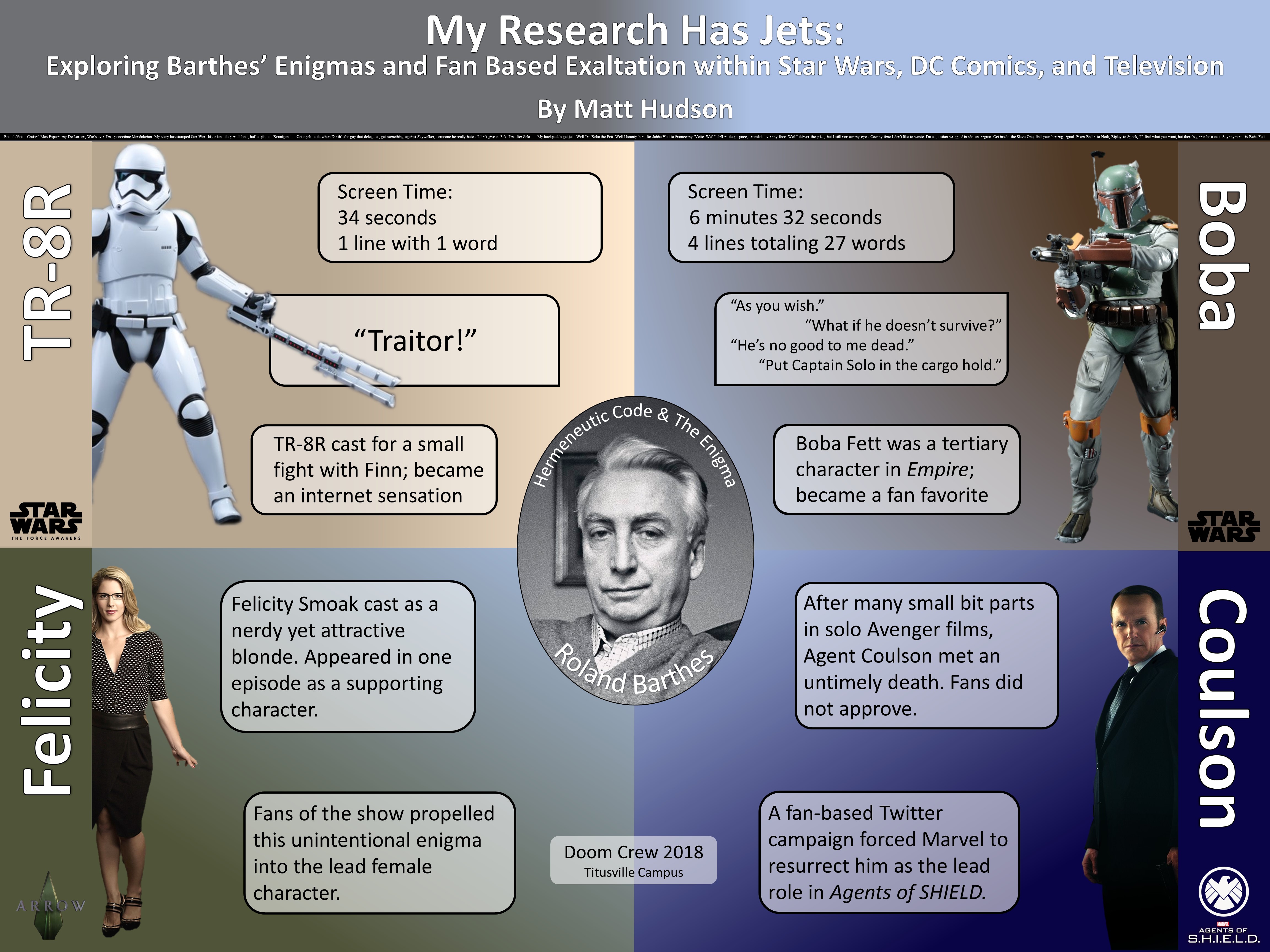
Example 4
While minimal in appearance, this research idea later became a chapter in an academic anthology concerning The Agents of S.H.I.E.L.D., due to be published in 2024.
Zoom in
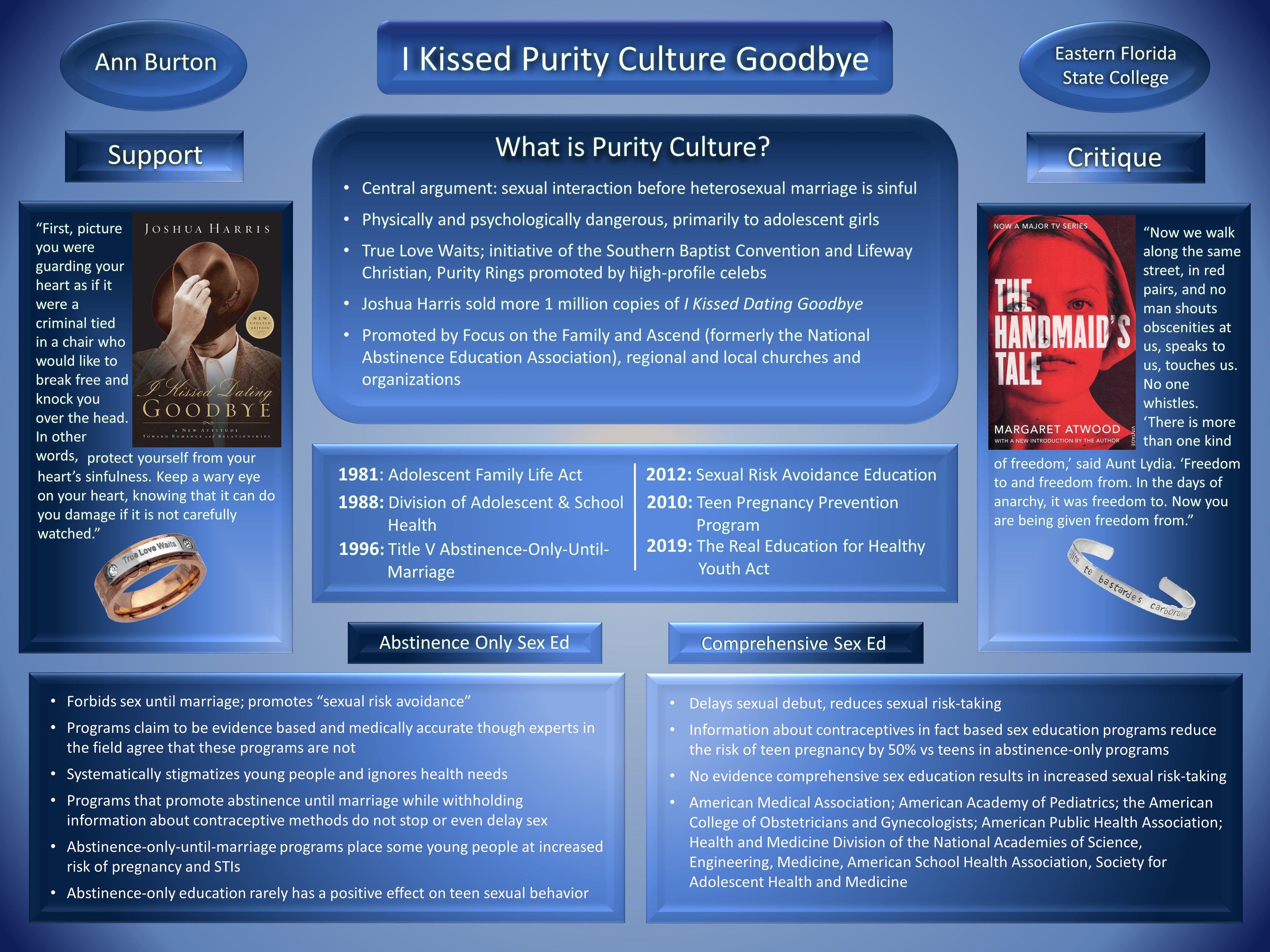
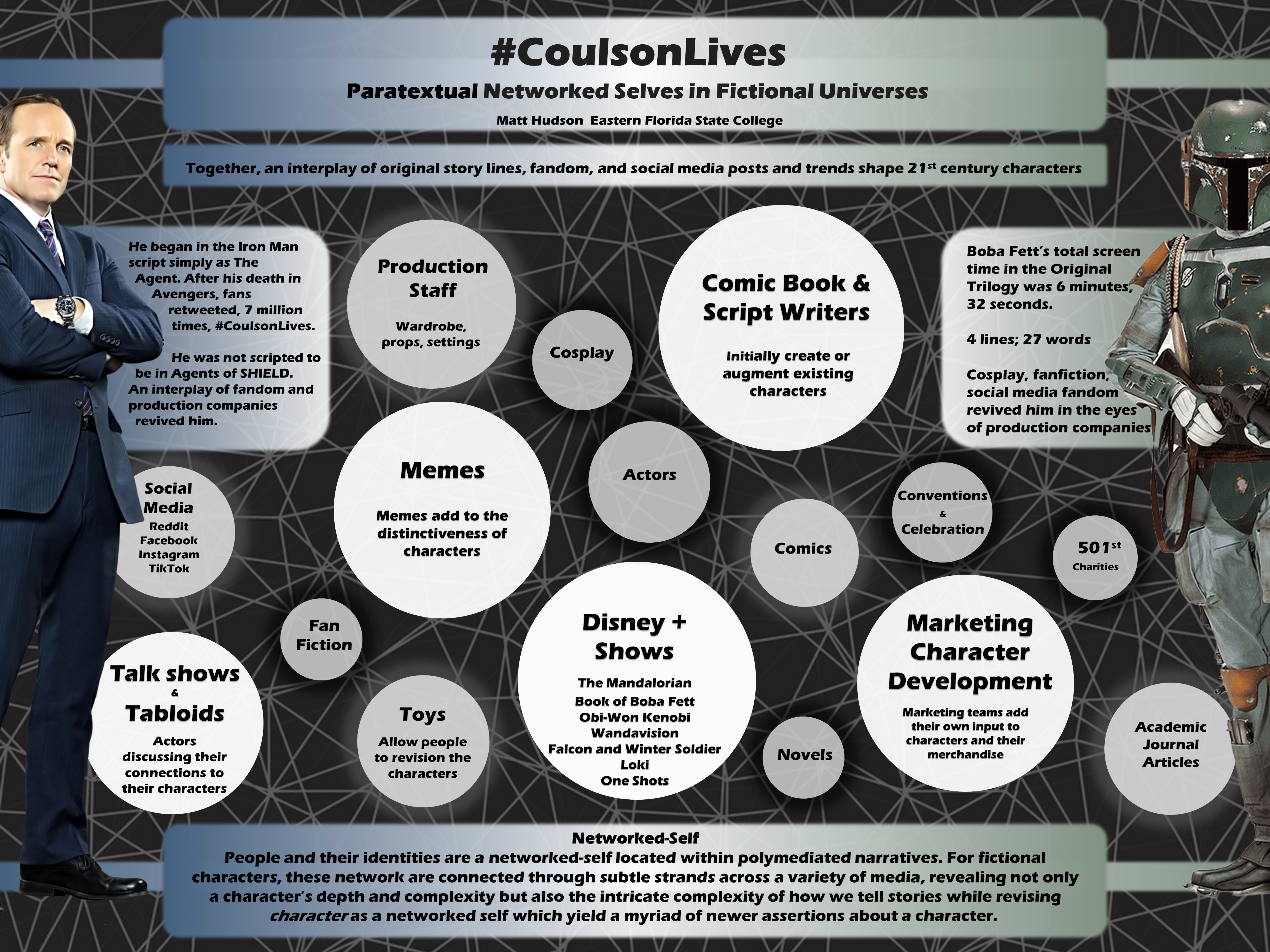
Example 5
This poster is the continuation of the one above--the next level of research after that previous poster.
Zoom in
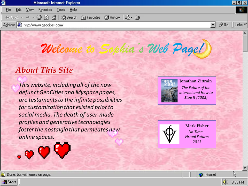
Example 6
At first blush, the poster is simple--but that's the point. The poster mirrors an early 2000's Geocities webpage as her subject is, in part, Gen Z's search for simplier web modalities, such as older forms of "social media," pre-facebook.
Zoom in
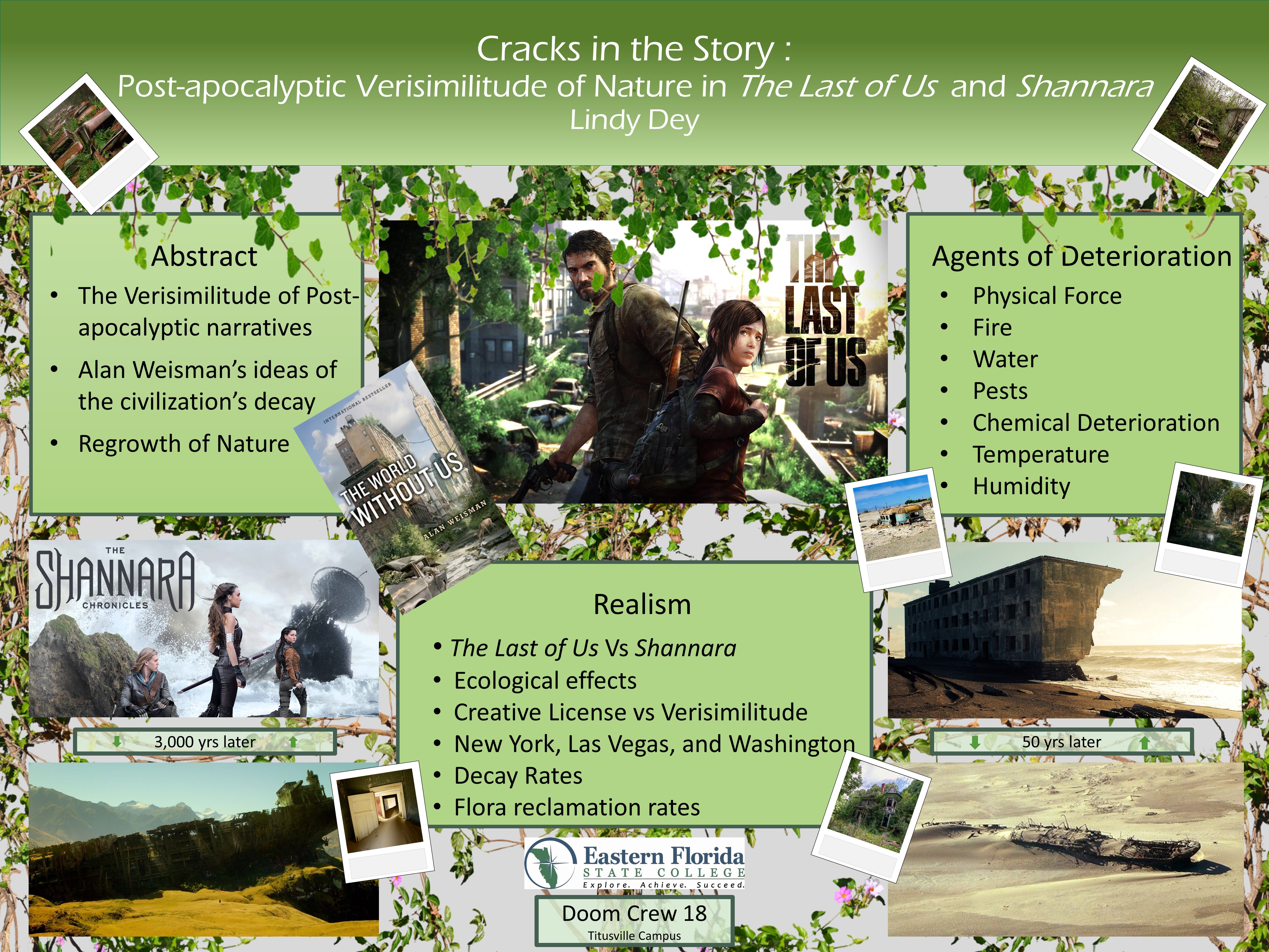
Example 7
By randomly placing polaroid images and a "brochure" onto the poster, the organized lower layer is disrupted, giving the whole poster a feeling of chaos or disorder, an appropriate expression for post-apocalyptic narratives discussed in the poster
Zoom in
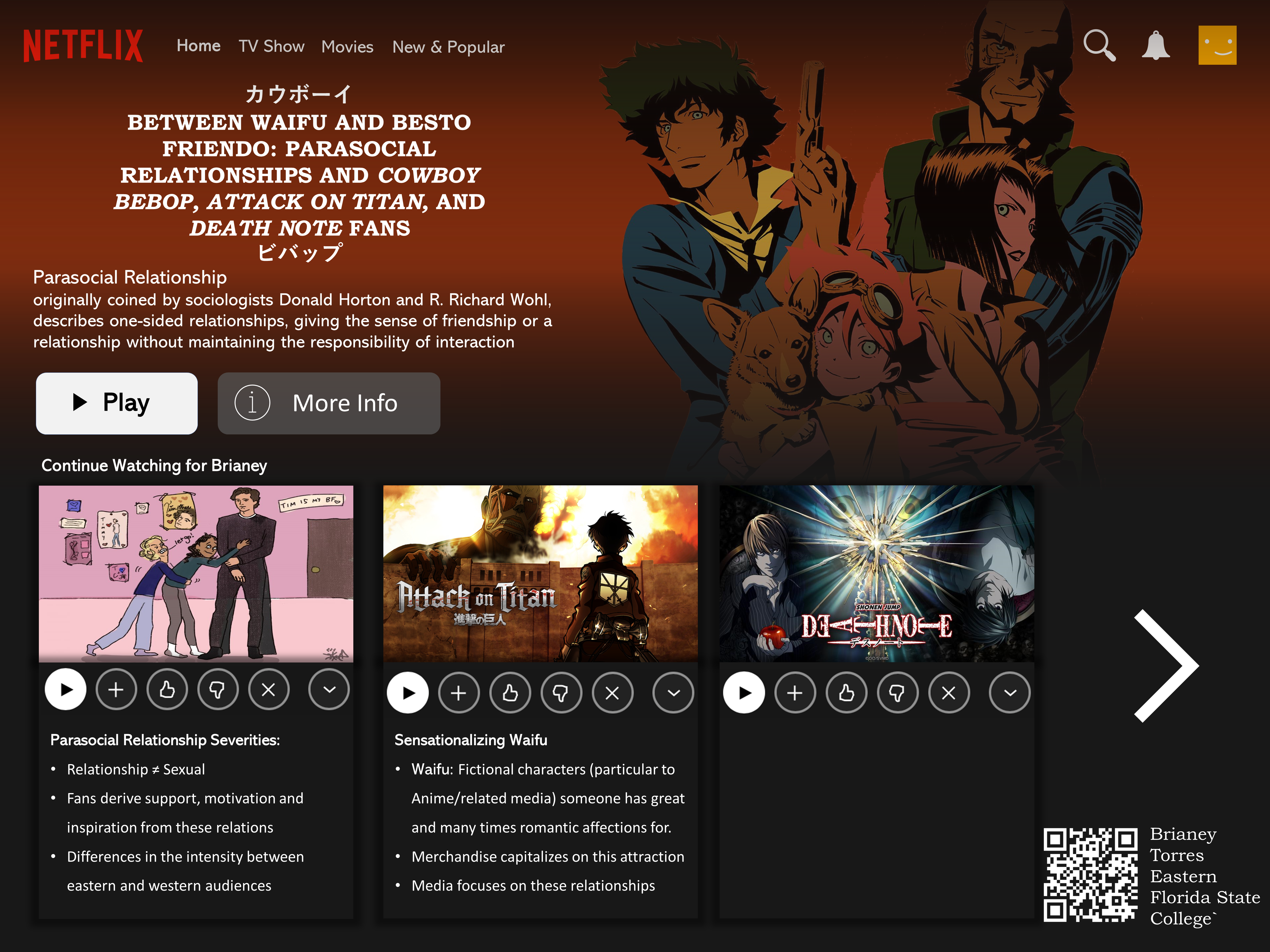
Example 8
This poster utilizes the metaphor of the Netflix interface. What's important here is that this is not a screen shot of Netflix or a one-to-one perfect representation; rather, this poster emulates without replicating, that Netflix interface.
Zoom in
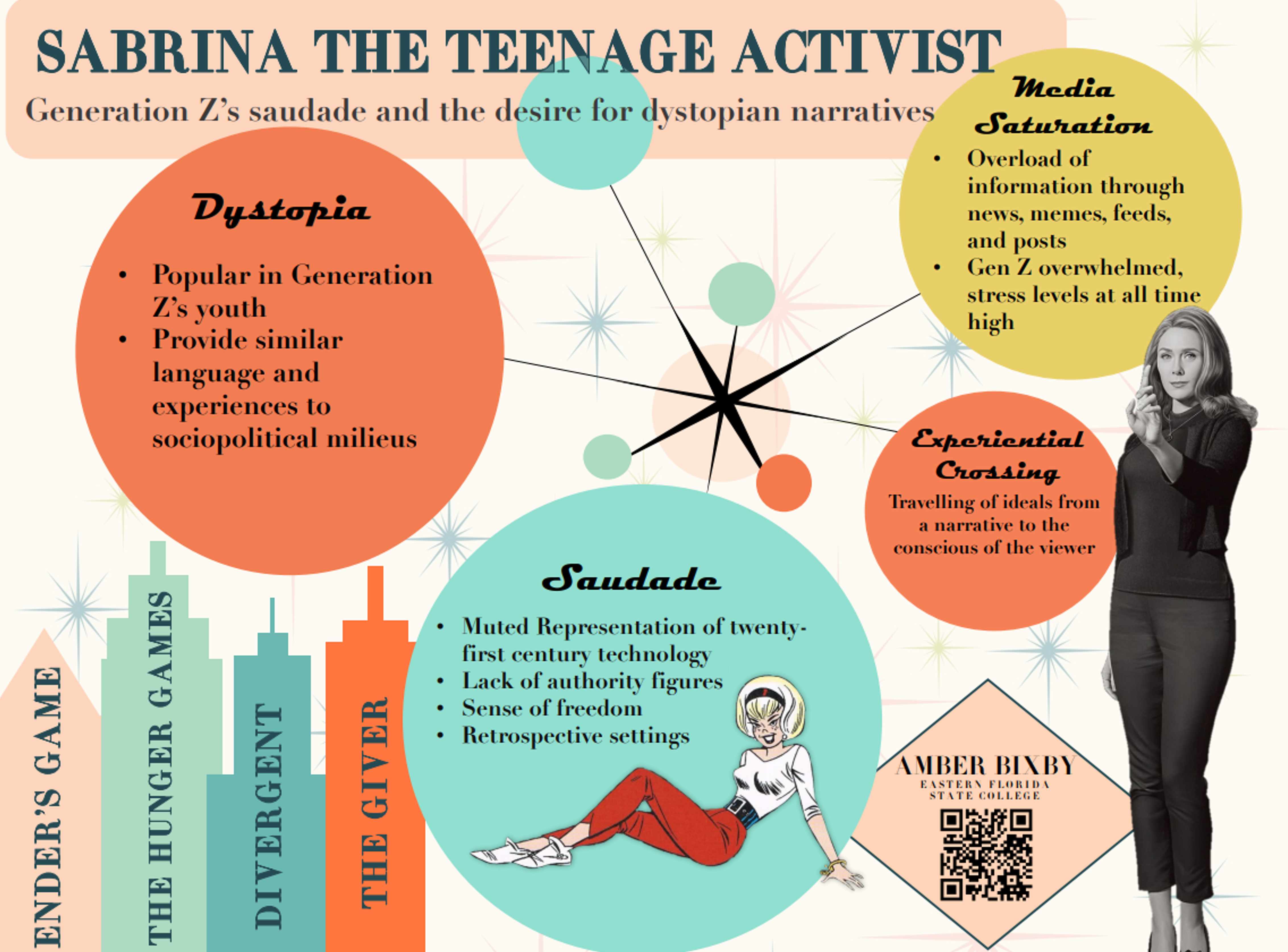
Example 9
This poster uses the stylized version of 1960's advertisments, mirroring Wanda's early episodes.
Zoom in